THE BASIS POINT

Mortgage Rate Chart: 1971 to Present


FULL SIZE

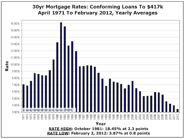
This chart is the latest on rates. The 2012 bar is yearly average through today, which is 3.9% with 0.8 average points. Points are fees as a percentage of loan amount used to “buy the rate down.” Points are on top of normal closing costs associated with a loan transaction.

Rates have traded lower than this 2012 average at very brief intervals in the past two weeks, but are creeping up for now.

These rates are for loans to $417k on owner-occupied single family homes with at least 20% equity and perfect credit. Here’s a weekly snapshot with more disclosures.

 

READ OUR NEWSLETTER

YOUR COMPETITORS ALREADY DO

Comments [ 7 ]
  1. joel lobb says:

    Nice article. Crazy to believe the rates right now. All those people banking on refi’s are going be sorry

    1. you mean loan agents banking on refis or homeowners are going to be sorry?

      1. Joe Conservative says:

        “All those people banking on refi’s are going be sorry”
        Joel Lobb threw out a warning without giving any details. I ignore comments like that because they seem to come from stupid people, who stopped short of explaining themselves because they really don’t understand how to explain their dire warning, which supposedly comes from their deep wisdom. Joel Lobb is just one more Shallow, Hal, IMHO.

  2. Thanks for the chart this helped a lot to understand the past inflation & the current on-going market inflation. The averages are shocking.

    1. No problem. Thanks for stopping by…

  3. Stats 202 says:

    Julian, it’s a bit misleading to show the y-axis minimum as 3.5%.  It makes it seem as if rates more than halves between 2011 and 2012 and can’t get much lower.  Not sure if that’s the subtle point you were trying to make in which case you did a nice job at allowing the visualization to play towards your goal.

    1. No agenda other than to show the long-term view. Also whenever I update this chart, I always make notes below the chart (embedded in the image) as well as add any relevant notes to the blog post so it’s clear what’s being represented. Thanks for the feedback. Based on your screenname, I’m guessing you look at a lot of charts! So if you see rate charts/data you like/prefer, please let me know … would love to take a look. 

WHAT DID WE MISS? COMMENT BELOW.

All comments reviewed before publishing.

four × five =

x