Quantitative Easing: Rate Recap & Timeline
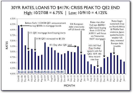
For the past 2.5 years, the Fed has run two rounds of rate stimulus known as quantitative easing (QE), which is bond buying to drive prices up and rates down. QE2 ends June 30, so here’s a chart recapping 30yr fixed rates from crisis peak to now. It’s labeled to show how QE1, QE2, and other factors impacted rates. Stay tuned as we track where rates go from here.
Click chart to enlarge, and see more Quantitative Easing 101 links below.

SEE ALSO:
– Quantitative Easing 101 (part 1): Timeline
– Quantitative Easing 101 (part 2): Dollar Impact
– Quantitative Easing 101 (part 3): Inflation Impact
– Quantitative Easing 101 (part 4): Consumer Q&A
