
How Mortgage Quality Improved 1999-2012: BAML
Bank of America Merrill Lynch (BAML) issued a great report today analyzing Fannie Mae loan stats from 1999 to 2012. There are three areas I’d like to highlight.
First: Their table below has key characteristics on 18.7 million loans originated during those years. BAML notes how the quality of underwriting has increased:
The average FICO increased from 718 to over 760, LTV fell from 73 to 68, and DTI fell from 39 to 34. The average loan size increased from 204k to 237k.

Second: A couple interesting charts from 2000 to present. On the home price appreciation vs. rates chart, prices are rising as rates dip. But low inventory is fueling appreciation more than low rates right now. Or to be more specific:
Tight underwriting + low rates => reduced supply + steady demand => rising prices
Definitely different from the last cycle where home appreciation was fueled by loose underwriting. Loan underwriting is as tight as it gets now, leading to the loan quality stats noted above. This at least provides some protection from another broader economic crash if the current home price trend reversed and prices fell again–because the underlying loans are less prone to default. Or as BAML puts it:
Loans originated in 2007 reached the highest cumulative default percentage of 14% six years after origination. Default rates on loans originated after 2007 are considerably lower as the credit quality of loans has improved and the macro environment has begun to recover.
BAML’s said that, even if there was a repeat of the collapse in home prices, the high quality of loan originations in the U.S. today makes their worst case expectation of cumulative defaults capped at 6-7%.

And of course the QE-fueled rate party makes the refi vs. purchase loan chart not so surprising. But it’s still a sobering reminder to see it visually. I can say that from the ground level, the consensus among would-be sellers is that if the current price trend keeps up, we’ll see more inventory—which means that purchase vs. refi bar for 2013 would have a lot more blue.

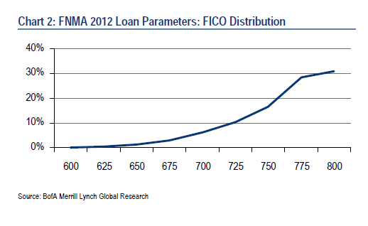
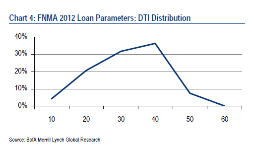
Third: A few charts showing credit score, debt-to-income, and loan-to-value ratio distributions for Fannie Mae loans in 2012. Debt-to-income (DTI) ratios are what all lenders in this country use to approve loans. A DTI is the percentage of a borrower’s income they’re spending on housing. The calculation is principal, interest, taxes, insurance (and HOA dues on a condo if applicable) plus all non-housing debt on a credit report (like payments on student loans, car loans, credit cards) divided by a borrower’s income. The income is gross if the borrower is salaried and it’s net if the borrower is self-employed. DTI ratios are pegged off of Fannie (and Freddie) templates that all lenders use and can choose to be more strict if they want—but the Fannie DTI cap is 45%. In 2012, the DTI for Fannie loans was 32%.

___
Source: Fannie Mae Loan Level Data Analysis & Risk Model (BAML, 5/2/13)