Reactions – in logo form – to We ❤️ NYC logo
Yesterday, The Basis Point team was discussing the new We ❤️ NYC logo to replace the classic I ❤️ NY.
Here’s what the new logo looks like:

Our creative director Dennis believes Milton Glaser, creator of the original I ❤️ NY concept, would not approve.
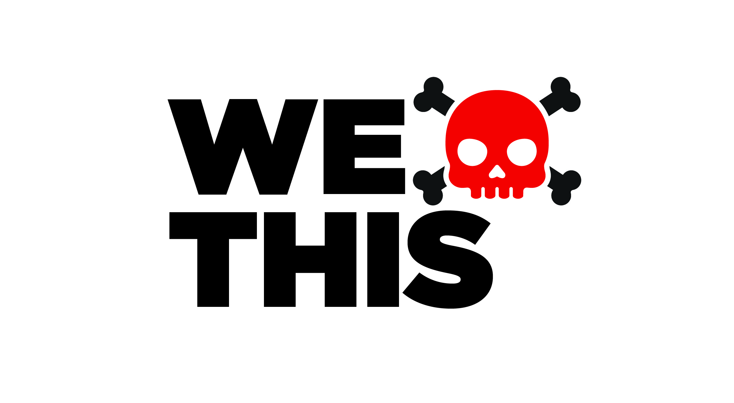
He offered a few reaction logos.
Here’s the first one:

Dennis noted: I’m sure the heart was in the right place (pun intended), but NY state as a whole is now left out of a new brand that focuses on just the city now.
Robyn (from Staten Island) also wondered which logo — old or new — non-Manhattan borough residents would wear.
Related: the original campaign was for New York State.
Which, when that sunk in, led to another reaction logo:

Yes, it’s about love, but ironically, the new campaign excludes the rest of the state.
This isn’t the fault of the designer, but a derivative of a beloved original was sure to have critics.
This comment from the internet frenzy, while harsh, is worth noting:
Oh. I’ve just gotten it – put out the worst logo ever and get NY to rally around the old one by proving how much people love NY. Genius.
It underscores the challenge of derivative works.
Homage or horrible. There is no grey area with most people.
In any case, creative work is always hard to judge, especially work aiming to reinvent (or tribute) a classic.
As a creative team, we respect that we don’t know the full context of how this new concept was derived.
But we’re not immune from reaction.
We predict the I ❤️ NY will live on because it’s brand intent transcends Manhattan.
And because, while there is no I in team, there is an M and an E.
Individualism prevails in people’s minds.
___
Reference:
– Visit Milton Glaser site, original creator of I ❤️ NY logo
– Internet in frenzy over new We ❤️ NYC logo
– The Basis Point Pop Culture, Media, Marketing posts
